Design and UX analysis
I'm very happy to be starting this blog on my experience at Dev Bootcamp. This is the first week of phase 0, and after a long preparation we are starting to build our own websites. Exciting!
As our first assignment, we are analyzing the design and user experience of 3 of our favorite sites, cosidering things as how pleasant they are to the eyes, how easy it is to find what you are looking for and etc.
My 3 site picks are Medium, Tuts+ and Mailchimp.
Medium

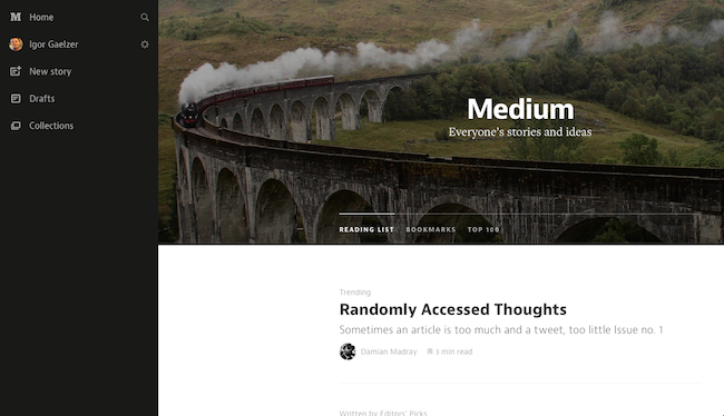
Medium is my very favorite site when it comes to modern design and usability. It is a platform for autonomous writers to post and share their articles.
What I really like about it is how it`s design is focused on the most important thing about this site, the content, and take away mostly all the other things we are used to see on other sites around the web.
Main strenghts:
- Estimated reading time for every article
- Saving articles for reading later
- Commenting and discussion on specific parts of the text
- Very minimalistic and content focused design
- Communication made through well chosen fonts and spacing
Tuts+

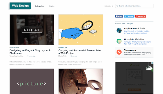
Tuts+ is a website on good programming and design practices. It has great content, and also online courses, that keep up with the newest trends comming up everyday.
What I like most about Tuts+, besides the content, is how easy it is to find the things you are looking for, how images complement the how it`s design is clean and well spaced, being easy on the eyes.
Main strenghts:
- Easy and clear navigations
- Minimalistic, content focused design
- Beautiful matte colors
Mailchimp

Mailchimp is an email marketing web app that lets you easily manage your contacts, create your campains, send them and follow up the results, like opens, clicks and convertions.
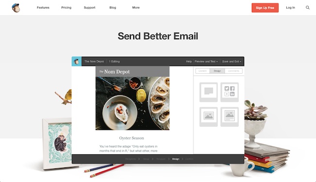
What I really like about Mailchimp is that it brings all the minimalism that many sites have been implementing to an actual app. Also, Mailchimp brings humor to the process of doing things, which makes it a very pleasurable app to use.
Main strenghts:
- Minimalistc design usually seen only in webpages brought to an app
- Uses humor to make the process of using it more fun
- Super easy to use
- Great value proposition - Send better email